Southern Figure Website
Problem
Women are underrepresented in the motorcycle industry, lacking a brand that speaks to their desires and needs. Existing platforms prioritize selling motorcycles over creating a welcoming and engaging experience for female riders.
Solution
Southern Figure website empowers women to navigate the world of motorcycles with confidence. We offer a curated selection of motorcycles alongside features that make choosing the perfect bike easier than ever. Forget the pressure of visiting dealerships – find the right fit, size, and style for your riding dreams, all from the comfort of home .
Role
UX research
UI design
Project
Self-Initiated
Timeline
2 weeks (2023)
Tools Used
Figma
Photoshop
Miro
Excalidraw
Design Process

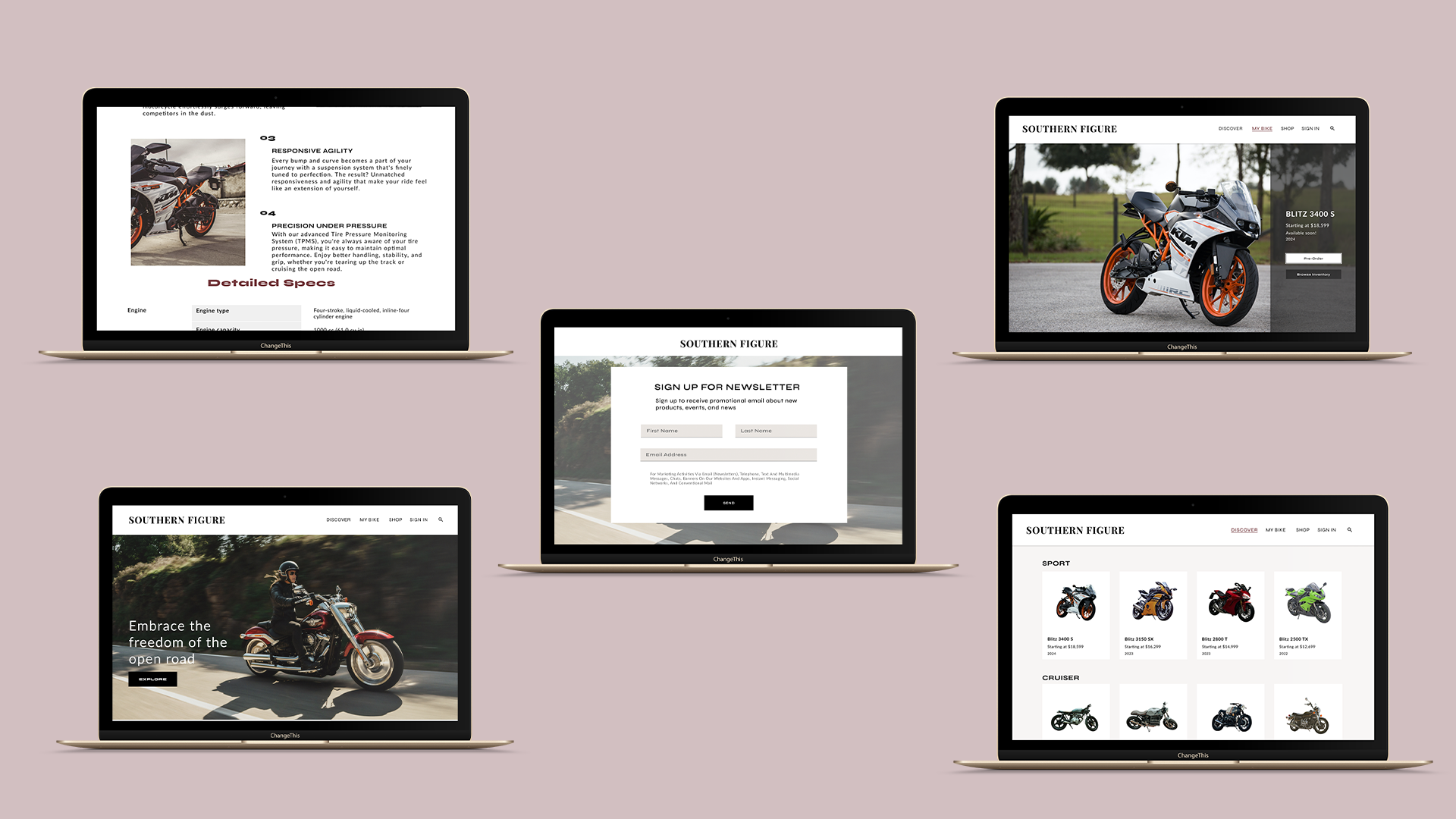
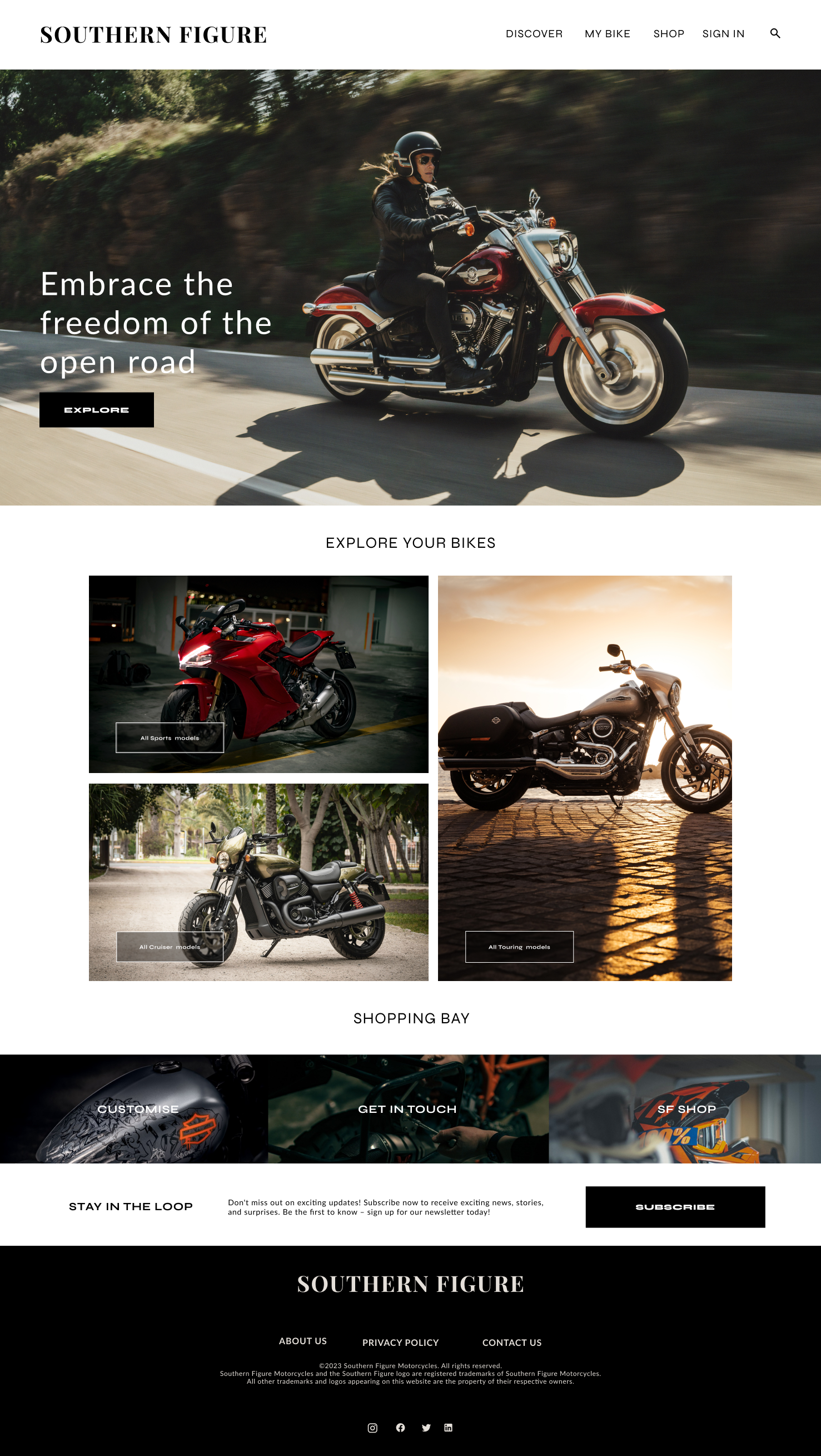
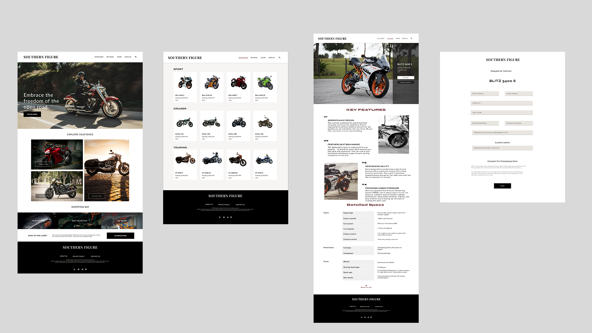
Home Page
This page emphasises the branding message to the key demographic of female motorcycle enthusiasts while retaining the goal of selling them motorcycles.
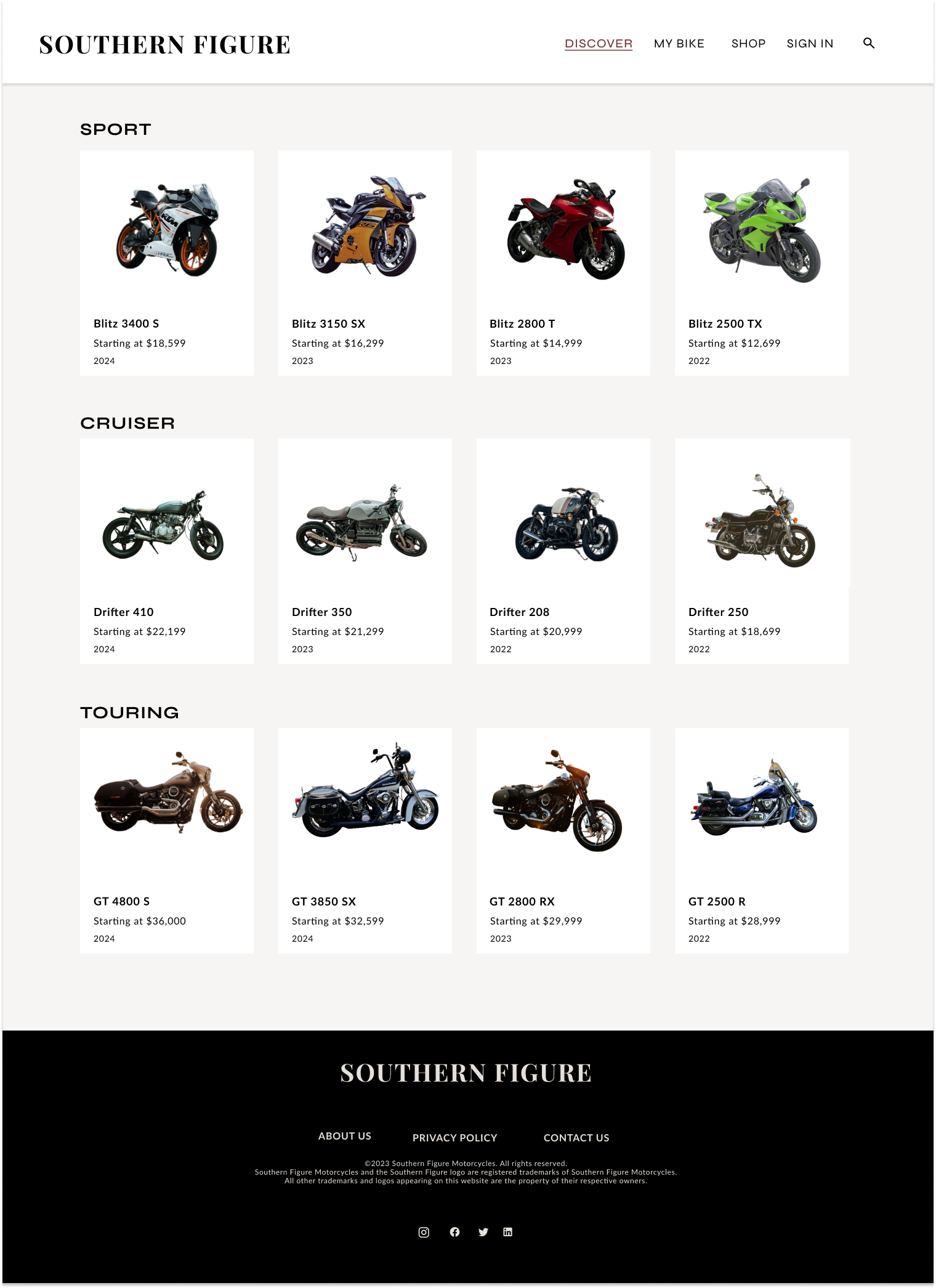
Shop Page
This page displays the various motorcycles that the company has to offer its customers.
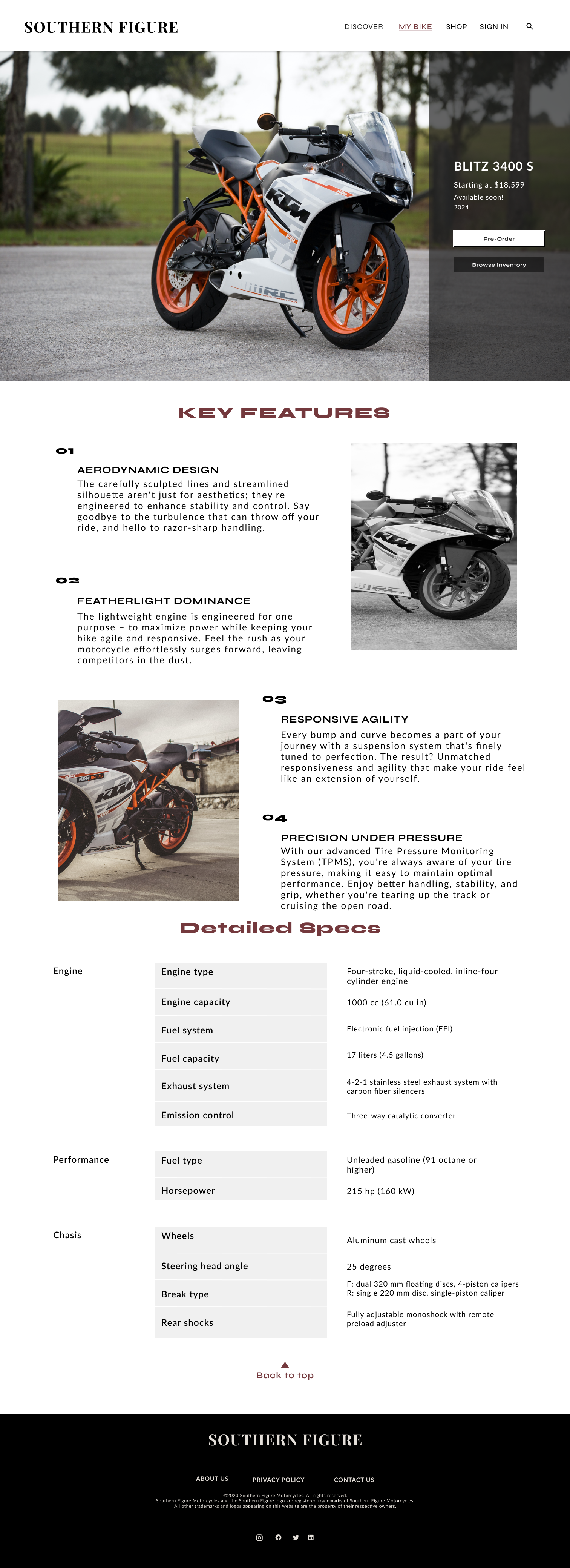
Product Page
This page shows the details of each motorcycle and a call to action button that initiates the checkout process.
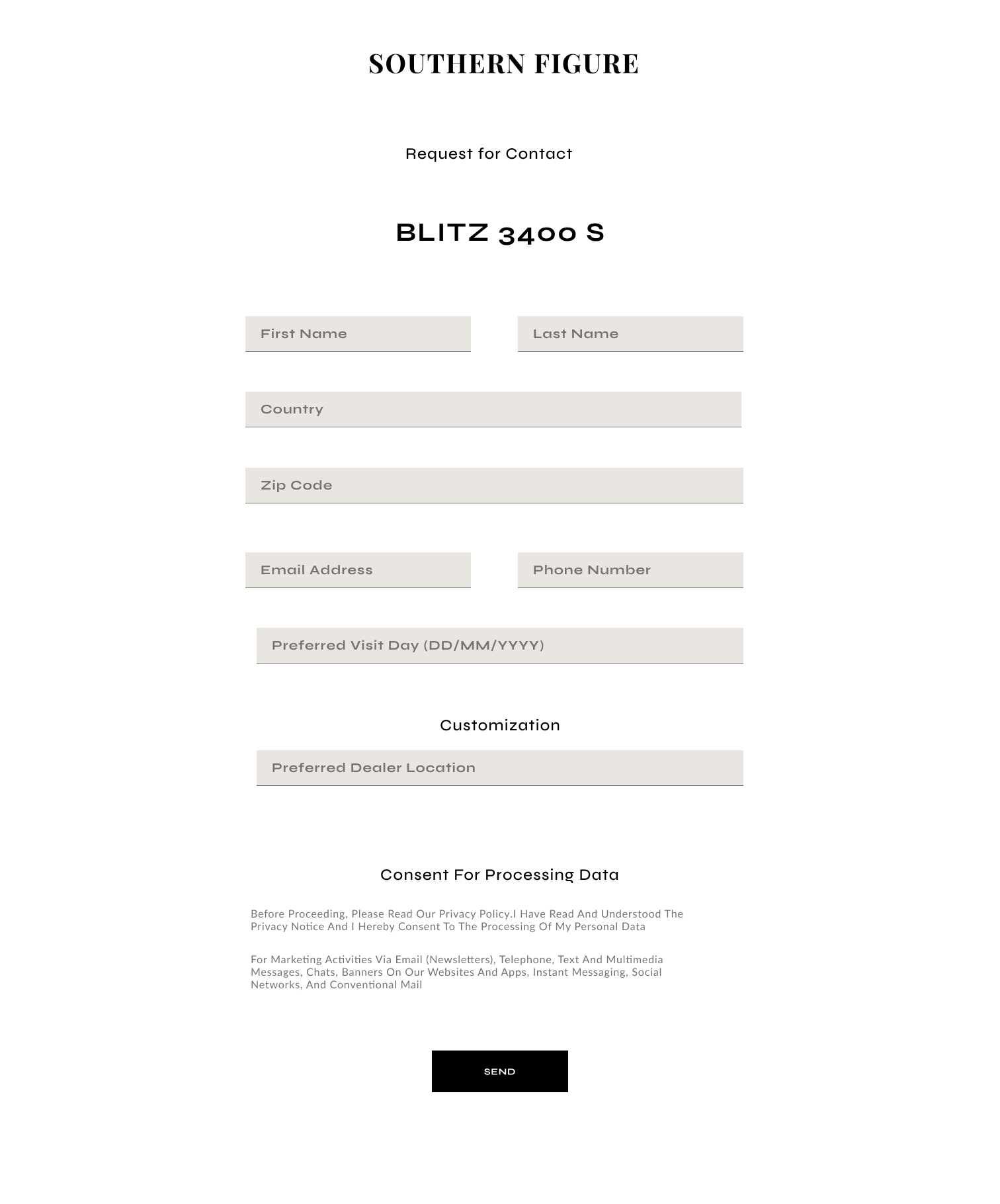
Checkout Page
This page displays the form a user would fill for the motorcycle they want. It enables them to setup a meeting date for them to plan a physical inspection of the item available in stock before commiting to a purchase.
RESEARCH
Understanding The Competition
This design approach started with a competitive analysis phase that provided valuable insights into prevailing industry trends and best practices employed by key players in the motorcycle marketplace.
By reviewing established platforms like MotorHunt and CycleTrader I discovered they offer robust marketplaces for motorcycle enthusiasts that facilitate the realization of their dream rides. However, a discerning assessment underscored a notable oversight – a lack of emphasis on the luxury segment.
With this in mind I further explored revered brands such as Ducati and Harley-Davidson in an attempt to understand what luxury looks like in the motorsports relm.
From this competitor analysis I deduced the following about the industry:
From here I decided to delve into the user's thoughts on the platforms they had encountered. My research goal was gaining clarity on the initial target user, their preferences and their experiences with other platforms.
What The Users Are Saying
Engaging and observing motorcycle-centered communities on digial platforms yeilded reliable information. However, this was a difficult task as these communities are not as many as I assumed they were. Regardless, this cemented the idea of having female identifying persons as the main target user for the rest of the design process.
Target Users
- New female riders in the motorcycle community.
- Female riders in the felt that they were not adequately represented by existing brands.
User Pain Points
The following user painpoints assertained the need to focus on women in the community as the target audience.
How Might I Questions
Using data from the preliminary research I came up with how might we questions that would guide how I intepreted the research points and ideated a potential solution.
With a clearer view on the research findings I created a clear problem statement to guide the rest of the design process.
Problem Statement
New female riders feel excluded by a lack of female representation and intimidated by the focus on luxury motorcycles. The buying process is overwhelming, lacking beginner-friendly resources. This creates a barrier to entry.
DESIGN
When deciding on which platform would best serve the users needs I decided to check the current behaviours of most automobile purchasers and compared it with my design goals. Initially creating a mobile platform seemed feasible following the assumption that users would want to easilly access the platform from anywhere.
However, considering the stage at which the user would discover the brand I found is better to work with a website. It offers the same benefits one would have with the mobile application. Moreover, if the brand was to grow with a sizable customer base then implementing a mobile appliation would be advisable.
Design Decision
Implementing the solution as a website due to its accessibility, content richness, community-building potential, and SEO benefits.
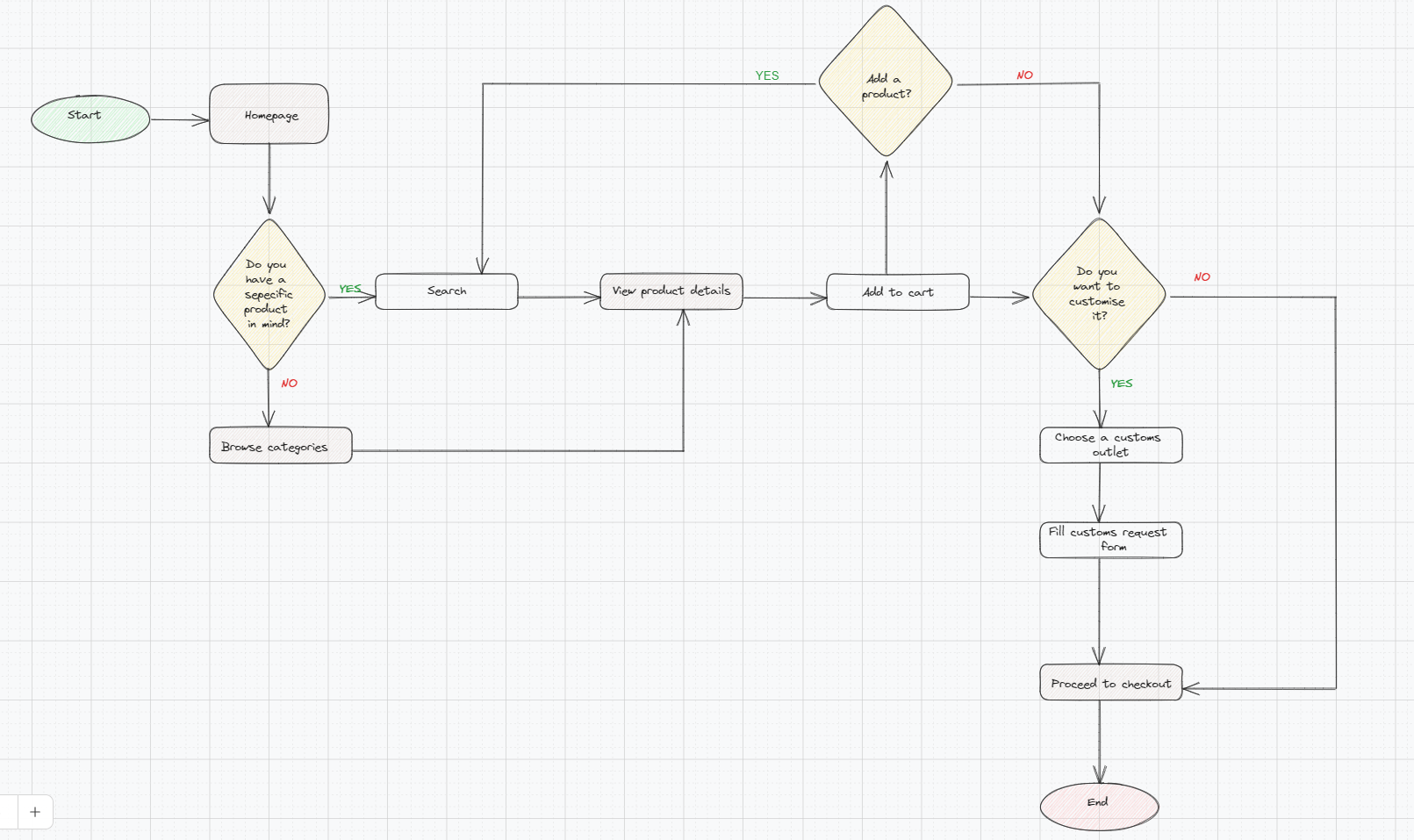
Based on the research findings, I developed a user flow, centering on the core function of the shopping experience.
This detailed flow outlines the precise steps a user would take to seamlessly browse, select, and ultimately purchase a motorcycle.
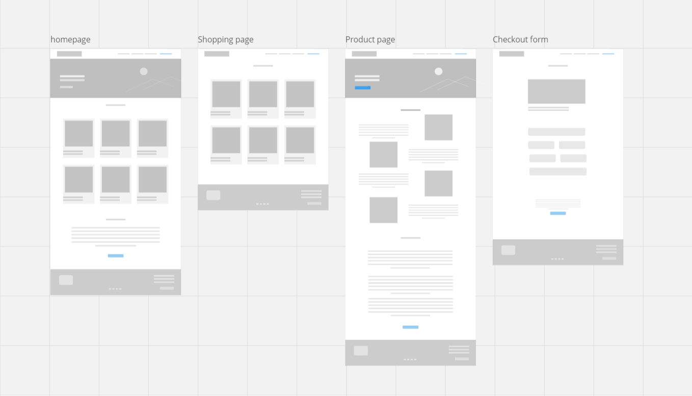
Ideate, Ideate, Ideate
These low fidelity screens were the part of the first visions I had for the screens outlined in the site map.
The main idea was relying on images to capture the users attention and reserving text for the important sections of the site.
After gathering feedback from a test group of 5 users I decided to change the gallery section on the home page to show the categories of bikes offered rather than displaying random bikes. This resulted in the hi high-fidelity prototype below
User Feedback
While this was a passion project I tested the final mockup With another smaller group using first click testing.
Design Implication: Added a searchbar to the navigation menu for easy querrying of data
Design Implication: Future versions of the platform should have a helpcare line on a help page or a chatbot users can communicate with
Design Implication: The future version should consider adding a payment method directly on the checkout page with a confirmation message.
This is a video of the hi-fi protoype created in Figma
REFLECTIONS
Challenges
I embarked on this project assuming the process would be linear however at several points I had to test and improve on the initial research to ensure i was meeting the need of the user and the business. This expanded my view on the impact user experience in building a successful product.
Finding enough test users. It took longer than expected to complete the project because I spent a significant amount of time recruiting willing participants. This limited the pool of testers and potentially the range of feedback I could receive
The timeframe I set for myself was a bit optimistic. A full project would definitely require more time to design and test all the necessary screens for a robust user experience. In the future, I'll need to factor in a more realistic time frame for these types of projects.